Where is Web Design Going? 4 Trends to Take Note of in 2016
March 24th, 2016
3 min read

"Trends, like horses, are easier to ride in the direction they are going."
- John Naisbitt
Like the wood paneling and olive-green appliances that gained popularity in home design in the 70s, web design trends fall out of favor. More importantly, new trends take their place -- trends that increase usability and reflect the design sensibilities of the times.
If you are hoping to give your website a makeover in 2016, you need to know where the trends are heading.
Note: While these may be the new and trendy things to do, it does not necessarily mean that any of these trends are good for your site.
As with anything, you should always test what you implement, and see if the trend you adopted works for your audience.
So now, on to the trends.
1. Single-Page Design
When planning a web design strategy, the user experience should be your primary concern.

Your prospects and customers have limited time to spend on your website, so you want to serve them content as quickly and efficiently as possible. That's why single-page web design has gained steam over the last year and shows no sign of running out of energy. It's a simple, minimalist solution that doesn't require many clicks (or, in the case of mobile users, taps).
In fact, single-page web design might prove most beneficial for mobile users. Instead of moving back and forth through multiple pages, they can give their screens a simple swipe to proceed to the next topic. It's also an elegant way to tie together various elements of a website.
Again, this is something you would want to test. Use software like HotJar, and record the user experience sessions. If you see that visitors are not scrolling, and getting to the area of the page you want them to see, look at reordering the content, or breaking up the content into additional pages.
Remember: What you don't test, you can't measure and improve.
2. Hamburger Menus Versus Strategic Navigation
 No, I'm not talking about the hamburger menu you see at Mcdonald's or Wendy's. I'm talking about this navigation menu you see on many websites. Though, this hamburger talk is making me hungry. =)
In 2015, more and more websites started concealing their navigation bars within the ubiquitous hamburger menu: the three-line icon with the word "menu" underneath it. While it might seem like a streamlined way to consolidate your navigation items, it can also frustrate users -- especially those who don't surf on mobile devices.
However, it requires the user to take an extra step to discover deeper pages of your website. Furthermore, people who haven't yet embraced mobile might not understand the hamburger, which means they'll click away instead of hunting for your content. Many websites will move away from the hamburger menu in 2016.
Others will find ways to integrate it more intelligently. For instance, adding the most important menu items to a navigation bar will please most users. You can then hide less critical content in the burger. It's a matter of balance.
Again, at the end of the day, you should test, test, and test some more to see how this menu structure affects your visitors.
3. Interactive Infographics
In 2015, infographics remained sufficiently novel to serve as clickbait as well as intriguing content. Now everyone has seen an infographic and understands its purpose, so expect websites to incorporate interactive infographics to step up their game.
In fact, entire sites might boast the interactive infographic theme, with each click allowing the user to dig deeper into the content and to better understand the brand. Interactivity allows the user to "own" the content; he or she connects with it on a deeper level because of the interaction.
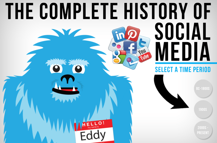
This is a fun, interactive infographic from our friends at Avalaunch Media.
4. Scalable Vectors
SVG images negate discrepancies between devices.

There's a wider range of screen sizes than ever before. People still browse the Internet on laptops and desktops, but they also use much smaller gadgets. On the other side of the table, some users have enormous screens or multiple screens that necessitate larger text and imagery.
That's what makes scalable vector graphics so valuable. They're vectors, so they don't lose image quality as you resize them. They look just as crisp and vivid on a 52-inch television screen as they do on a smartphone.
Expect SVG usage to ramp up in 2016 as more designers embrace their flexibility.
Wrapping This Up
As web design trends evolve, your website can either embrace them or work against them.
If you are looking to embrace some of these, and other trends into your website, we here at Bernco Media are here to help.
However, if you are not quite ready for that, you may want to learn about a new trend in web design called Growth-Driven Design.
Until next time,
Doc
Owner/Head Coach @ Bernco Media. Digital sales & marketing since 1997. Passion for teaching companies to be the most trusted voice in their space. They Ask, You Answer Certified Coach & HubSpot Certified Partner & Trainer. Reversed Type 2 Diabetes doing KETO. Wears Mickey Mouse Daily. Daydreaming of next Disneyland Trip.
Topics:
